Welcome to TXP page.
General.-
In what follows you will find the README file --a shorter version will be included in the distribution package-- and we encourage you to really read it. We will explain all the details of the routine and how to use it with all its possibilities. Afterwards you can download the small packaged distribution where quite a lot of very small programs, scripts and macros constitute the totality of TXP. (The download place is at the bottom of this page, if you don't want to wait anymore.)
Policy.- This software is free software under the conditions of the GPL license. Apart from that, anyone can do what he/she wants with the routines included in the package, with the sole condition to mention the origin if he/she modifies something and use it in a public way. The mention must be in this terms: First public version created by J.J.Arribas & S.Muelas (August 2000)
README
In the next lines we will explain how to use the package TXP to obtain the most of it. We begin by listing all the possibilities offered by this macro-routine:
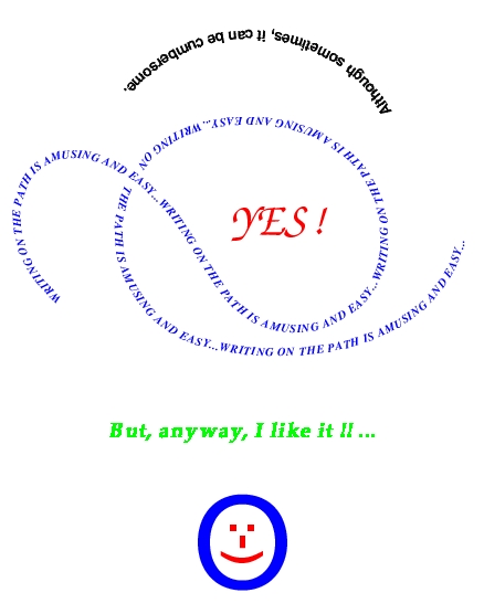
- It is possible to write a paragraph as long as wanted, althought in a single line, over a curve or "path".
- The curve can be shown or remain hidden, acording to the preferences and/or the effect wanted.
- The letters or glyphs can be placed in the position desired with respect to the curve: over, down, in the middle ..a.s.o.
- Any font family can be used, provided that there exist the disponibility of the *.tfm and *.bfd files, or similars.
- The scale of the fonts can be changed at will, without any practical limitation.
- The scale of the path or curve can be changed at will, without any practical limitation.
- The beginning of the paragraph over the curve can be choosen or defined, with total precision.
- The separation between the characters can be modified at will, without any practical limitation.
- Any color as defined by metapost can be applied to the text.
- Accentuated letters are allowed (not included in distribution). At the moment only for spanish, but will be done upon request for any other language.
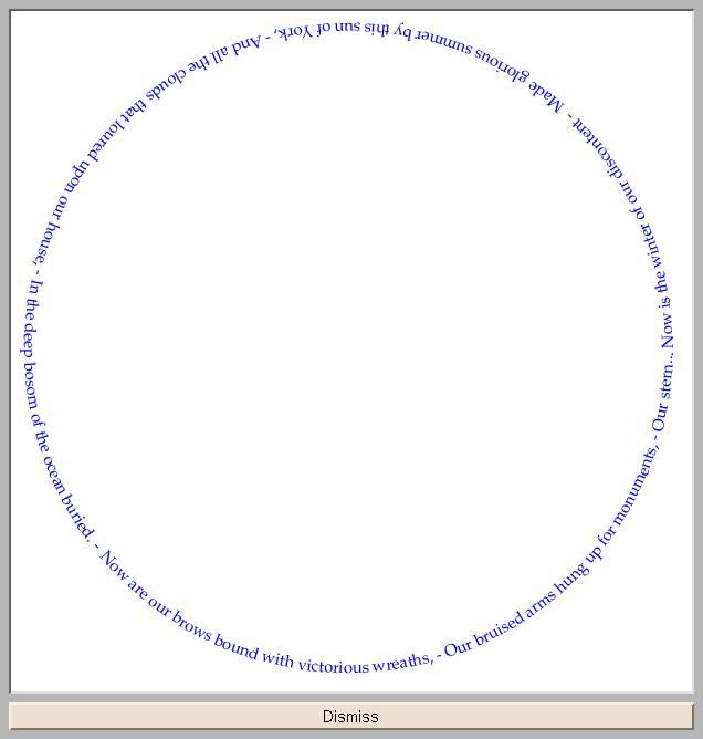
- Any acceptable "path" for metapost will be accepted by TXP, including the closed path. The origin for the writen text will be the first point of the path. This includes metapost instructions like "fullcircle", for which probably most people don't know were it begins. You will see that Hobby has done a logical affaire, beginning with an angle of zero degrees and going in an anticlockwise way until 360 degrees. But not always logical behaviour is the best for everything. The written text is not nice placed in this way. With METAGRAF, to change it would be a matter of a couple of mouse-clicks, but otherwise....
- The placement of the characters over the line is absolutely precise. It must be understood that this exactitude is related with the boxes of the glyphs. If the letter is very big and also is the curvature, it is not possible --up to this moment-- to place the whole character perfectly joined to the curve. The perfect coincidence is between the bottom corners of the box and the points of the curve.
Those are the principals caractheristics of TXP (and it is surprising to be abble to do so many things with a so short routine: around 20 lines).
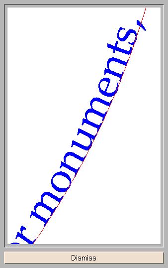
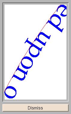
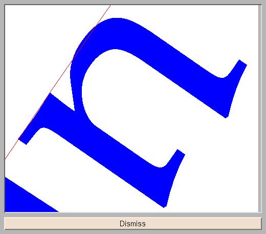
(If someone is in a hurry, please go directly to the next paragraph...) Now, when writting these lines, a test has been made with a circle. Here is the "result". Althought a little bit too big, this is an interesting shot. If looked in detail someone could think that certain characters are not in the right place. Lets look at the letter "e" in the word "momuments", almost at the end of the paragraph (at right under the theoretical middle line). Well this "e" seems to be "down_its_right_place", almost charging all its weight over the poor "m" before it. But this is not true. It is just an optical effect as will be seen. And care must be taken when speaking about precision using a computer screen. If in doubt, the printer doesn't deceive. So, let's look at this "e" closer. O.k. (this is a small shot). Now we see our letter in reality. This poor "e" doesn't approach specially the strong "m". A similar approach can be made for the word "upon" head_down at left in the upper corner (appxt. at ten o'clock). Well, what is doing this crazy "o". She is jumping out of the line!....no, not exactly. Lets look once more closer. So...the "o" is well placed....but now, in this last shot it seems that the "u" in its round part, is just touching the line and usually, round letters goes a little bit under the line, as it is clear with the letters "o" and "e". Perhaps a mistake of TXP?. Another shot lets see that the "u" is placed in the correct place. Look at it. Quite impressive, isn't it?.
Now let's know how are controlled all this possibilities of TXP. Everything is done in the program principal, the one who calls the macro, so this last doesn't need to be retouched.
To call TXP we need to add nine parameters that will include all the information needed by the macro. Let's explain what this parameters are for:
- The first one represents the paragraph or string to be written. No default.
- Second is the path or curve or line that will be used as the shape of the final text. No default.
- Third is the value of the scale choosed for the characters or letters or glyphs. Default = 1.
- Fourth is the value of the scale choosed for the path. Default = 1.
- Fifth parameter represents the distance in perpendicular between the "line_path" and the glyphs to be placed. The unities to be used are the same as those used by the fonts data. To have a precise idea, a "palatino" big A is around seven unities high. A positive value moves the characters to the left of the path, if the direction is from the first point to the last one. Default value is zero, but it must be said that characters are placed by default, in a position that makes the line_path to be the baseline. This is the "normal" position in most cases, when something is written with the shape of a circle or ellipse or if some control over the placement of glyphs is wanted (as has been done in the shots shown). But if the path has inflexion points and the curvature is not small, this placement is not a reasonable one, as the upper part of the characters over the convex part will have more space between them that the characters in concave places. Then, it seems that placing the line_path in the middle of the string would be the right solution. That means to give a value around "-3" to this parameter. As there are significant differences between differents fonts, the easiest thing to do is to try with some value and look the result. Then the final value can be fine-tuned as an extreme precission is not needed.
- Sixth parameter is the distance from the beginning of the curve to the first character that will be written. Default is zero, but this parameter is useful for placing the string where it is wanted very precisely. Note that althought the "circle" instruction in metapost is not the best to write text over it, it is posible to make some simple arrangements to make it useful, i.e. if an affine transform is applied to rotate the circle 180 dg. and to make a reflexion over the horizontal axis, the string will begin at left and will continue over the upper part of the circle.
- Seventh parameter is the "extra_distance" that is wanted between the characters of the string. Default value is zero, and this value means that they will be placed as in a normal string written with the fonts choosed. This is also a very useful parameter as it permits, for example, to write normal, horizontal text but with a bigger separation between the characters than the standard one.
- Eighth and one before the last serves to choose the color to be used by the pen. It is possible to apply any color as defined by metapost to the written string.
- Ninth and last parameter is the thickness to be used in drawing the path. Default is zero so no path will be draw. Values as thin as 0.01 can be used.
Now let's write a couple of lines about the program principal. This program can be any standard one written using metapost. If it is wanted to introduce a call to the macro-routine TXP there are some lines that must be introduced. The "skeleton" needed is included in the file "call_txp.mp" in the distribution package. Here are the lines to input:
- input txp;
- color loc; string ss; path a;
- scalet:=1; scafig:=1; hy:=0; tt:=0; sep:=0; loc:=black; lin=0;
- defaultfont:= (Font used if different from standard cm. For example regular roman palatino:) "pplr8r";
- ss:= (String to write, for example:) "Writting_on_the_path is amusing and easy...";
- a= (The path:) z1.. controls z2 and z3..z4;
- (Here any modifications to the default values, for example:) scalet:=1.24; hy:= -2.8; tt:= 28; sep:= 0.3; loc:= red; lin= 0.1;
- txp(ss,a,scalet,scafig,hy,tt,sep,loc,lin);
And that's all. The call to the macro can be repeated as many times as wanted maintaining or changing the parameters, path and string.
Finally, it must be said something about fonts and how to use it and create new data-font. In the distribution there are included the datafont files for Times, Palatino, Helvetica, ZapChancery and TeX Computer Modern. There are also included a short routine written in AWK (five lines long) called "gentyp.awk". The way of proceeding is as follows:
- Suposse that the datafonts for "Palatino bold" must be created. The name for "palatino bold" in TeX distributions and coming from Adobe is pplb8r. So it is necesary to find the file pplb8r.tfm. Usually, it is in .../texmf/fonts/tfm/adobe/palatino/pplb8r.tfm in Linux and Windows distributions. A copy of this file must be made in the TXP_working_directory.
- A program included also in TeX distributions that will be needed is one called tftopl. Usually it is in the PATH of the computer. Otherwise, it must be found and included where it can be used.
- Those are the tools needed to create your data files for the fonts wanted, with the awk routine included in this distribution. (Theoretically it would be enough to use directly the *.afm files in TeX distributions but unfortunatelly not always the *.tfm files included correspond exactly to the *.afm files. So the difference in "work" is small and the security to use the right ones is extremely important).
Now that all the tools are "on the table" let's do the work. Those are the steps:
- Once in the working directory, it must be written: tftopl pplb8r.tfm pplb8r.pl. RETURN
- Then: awk -f gentyp.awk pplb8r.pl. RETURN
- Then: cp fontdat fpplb8r. RETURN
Finally, the file "fpplb8r" has been created. This is the file where all the information about the fonts needed by TXP is included. Once a file of this kind has been created, it can remain without changes as long as the Adobe Fonts are not changed....
The last step in the process is to input the file fpplb8r in the "program.mp" used. In the distribution a program called "example.mp" will permit to try and understand most of the features.
Once done this last step everything is ready to begin writing beautiful logos or strange messages. It must be noted that it is possible (and simple) to write, for example, on a circle some paragraph with a type and a size of font and then in the inner surface of the circle something on a right line with another size and family of fonts. This is a matter of personal choice.
Another possible and simple thing is to modify the TXP macro, for example to change the color of every character or to scale them only vertically or horizontally...It has not been given as standard because the number of parameters must remain in a reasonable amount. But looking at the source, it can be understood how simple it is. We plan to increment the capabilities of our macro if we are able to maintain it simple, what was our first goal.
Have a lot of fun !